Simplifying SOTI Snap’s theming: creating a seamless customisation experience
B2B
B2B
Web application
Web application
SaaS
SaaS
Read time: 12 mins
Role
As sole Product Designer, I led the end-to-end redesign of SOTI Snap's theming experience partnering with the team to define, iterate, and deliver a more intuitive and brand-consistent app building flow.
Team
1 product designer
1 product manager
5 software engineers
Timeline
1 month
Background
SOTI is growing day to day. It has
17,000
customers worldwide
17,000
customers worldwide
20+ million
devices
20+ million
devices
6
in house products
6
in house products
One of its flagship products, SOTI Snap, which is a drag and drop tool, it help companies to rapidly build mobile apps without coding . By data-capturing capabilities of mobile devices (e.g., camera, barcode scanning, video recording), It helps businesses replace paper-based processes, turn into digital data collection, and streamline approval workflows. This enables companies to save money and get the most out of their mobile device investments.
Despite being a robust product, there is always room for improvement to enhance the user experience.
Let’s read this narrative
About
Mr. Paul, a logistics manager at Velocity Warehouses, uses SOTI Snap to build inventory tracking apps. While trying to match his company's branding, he encounters limitations.
Mr. Paul, a logistics manager at Velocity Warehouses, uses SOTI Snap to build inventory tracking apps. While trying to match his company's branding, he encounters limitations.
Limitations
The app only allows basic color changes per page, lacking options for global theme updates, custom icons, fonts, or brand patterns. This results in inconsistent branding.
The app only allows basic color changes per page, lacking options for global theme updates, custom icons, fonts, or brand patterns. This results in inconsistent branding.
Problem
As a non-technical user, Paul struggles with complex settings and feels frustrated and disappointed as changing icons and colours takes quite sometime.
As a non-technical user, Paul struggles with complex settings and feels frustrated and disappointed as changing icons and colours takes quite sometime.
After discovering an alternative tool with better branding features, he started creating company apps on it to improve staff engagement and company image. This seems to be a time-efficient process to him.
After discovering an alternative tool with better branding features, he started creating company apps on it to improve staff engagement and company image. This seems to be a time-efficient process to him.
In our one-on-one conversations with customers like
In our one-on-one conversations with customers like
In our one-on-one conversations with customers like
McDonald's,
McDonald's,
T&M Bowser Solutions,
T&M Bowser Solutions,
Essmann's Backstube,
Askari,
Askari,
Essmann's Backstube,
Essmann's Backstube,
and many others, we learned they share these same sentiments.
They feel disappointed that the app doesn't reflect the professional image they want to showcase.
and many others, we learned they share these same sentiments.
They feel disappointed that the app doesn't reflect the professional image they want to showcase.
Framing problem
Before diving into the problem statement, let’s first understand the core issues through the video and key observations below.
Limited product capabilities
Users have to manually change components colours on each and every screen.
The old settings were optimised to build low key apps with one screen.
The system doesn’t enable users to get started quickly
Users have to manually change components colours on each and every screen.
The old settings were optimised to build low key apps with one screen.
The system doesn’t enable users to get started quickly
Time-consuming manual effort
Updating icons and colours across every screen feels like a repetitive, manual burden.
There is no way to apply changes globally, making the process slow and inefficient.
What should be a quick task ends up consuming significant time, hindering productivity.
Updating icons and colours across every screen feels like a repetitive, manual burden.
There is no way to apply changes globally, making the process slow and inefficient.
What should be a quick task ends up consuming significant time, hindering productivity.
Mental modal mismatch
Non-tech-savvy users expect a simple interface that allows them to easily customise the appearance of their app. However, the current system's limited and rigid functionality creates confusion.
Non-tech-savvy users expect a simple interface that allows them to easily customise the appearance of their app. However, the current system's limited and rigid functionality creates confusion.
Fragmented user journey
Users are forced to seek external solutions with SOTI MobiControl to complete their entire lifecycle; from deployment to retirement. This negatively impacts and reduces the effectiveness of SOTI as a one-stop solution.
Users are forced to seek external solutions with SOTI MobiControl to complete their entire lifecycle; from deployment to retirement. This negatively impacts and reduces the effectiveness of SOTI as a one-stop solution.
Problem Statement
Non-tech-savvy users find app customization confusing and time-consuming due to limited and rigid theming capabilities.
Non-tech-savvy users find app customization confusing and time-consuming due to limited and rigid theming capabilities.
How might we reduce the time and effort required to update colors, icons, and styles across an entire app?
How might we reduce the time and effort required to update colors, icons, and styles across an entire app?
How might we create a theming system that scales from simple to complex apps without increasing user effort?
How might we create a theming system that scales from simple to complex apps without increasing user effort?
How might we simplify app customization so that even non-tech-savvy users can easily control the look and feel of their app?
How might we simplify app customization so that even non-tech-savvy users can easily control the look and feel of their app?
Identifying the opportunity
The current theming in SOTI Snap presented us with the unique opportunity. While other tools offer advanced customisation, they’re too complex for form-based apps. This is a great opportunity to create new theme experiences which is familiar and easy to use for our end user.
The current theming in SOTI Snap presented us with the unique opportunity. While other tools offer advanced customisation, they’re too complex for form-based apps. This is a great opportunity to create new theme experiences which is familiar and easy to use for our end user.
Our goal
''Let's create a simple, flexible, and intuitive theming experience that empowers non-technical users to build their apps.''
''Let's create a simple, flexible, and intuitive theming experience that empowers non-technical users to build their apps.''
How to reach our goal?
Make improvements step by step, listening to user feedback along the way.
Add a real-time preview and a library of ready-to-use templates to help users get started quickly.
Make sure any theming changes instantly update across the app, keeping everything consistent and hassle-free.
Make improvements step by step, listening to user feedback along the way.
Add a real-time preview and a library of ready-to-use templates to help users get started quickly.
Make sure any theming changes instantly update across the app, keeping everything consistent and hassle-free.
How to measure feature success?
Keep an eye on how often users are using the new theming features to make sure they’re finding value in them.
Track the time users take to complete an end-to-end screen, measuring whether the new theming features reduce effort and speed up the app-building process.
Gather feedback through user insights to understand how happy users are with the new theming experience.
Track whether users are moving away from third-party tools, showing that the built-in theming meets their needs.
Planning the approach
a. Define the anatomy
I started laying the foundation for the Setup popup (App settings). Aim is to give user what they need. First of all I started to gather answers for understanding theming process.
I started laying the foundation for the Setup popup (App settings). Aim is to give user what they need. First of all I started to gather answers for understanding theming process.
What is theming process? It is customizing the visual appearance of an app to align with a brand's identity. This includes modifying elements such as colors, fonts, spacing, and components to create a consistent and professional look that enhances user experience.
What is theming process? It is customizing the visual appearance of an app to align with a brand's identity. This includes modifying elements such as colors, fonts, spacing, and components to create a consistent and professional look that enhances user experience.
Who will use this feature? Non-technical users- Such as business administrators, marketing teams, and operations managers who need to create branded apps without technical expertise. IT teams (May use)- Ensure compliance with brand guidelines and consistency across company-wide applications.
Who will use this feature? Non-technical users- Such as business administrators, marketing teams, and operations managers who need to create branded apps without technical expertise. IT teams (May use)- Ensure compliance with brand guidelines and consistency across company-wide applications.
When will they use this feature? Initial app setup: When creating an app for the first time, to establish a brand-compliant look. Brand refreshes: When updating the app’s appearance to match new branding guidelines. Seasonal campaigns: When temporary updates are needed for specific events or promotions.
When will they use this feature? Initial app setup: When creating an app for the first time, to establish a brand-compliant look. Brand refreshes: When updating the app’s appearance to match new branding guidelines. Seasonal campaigns: When temporary updates are needed for specific events or promotions.
Which apps use this specific feature? Customer-facing apps: Such as ordering apps, loyalty program apps, and event registration apps. Internal business apps: Such as employee portals, inventory management apps, and HR-related applications. Operational apps: Such as inspection checklists, compliance forms, and service request apps.
Which apps use this specific feature? Customer-facing apps: Such as ordering apps, loyalty program apps, and event registration apps. Internal business apps: Such as employee portals, inventory management apps, and HR-related applications. Operational apps: Such as inspection checklists, compliance forms, and service request apps.
Now the next step was to arrange these inputs into a layout which is easy to navigate and interact with. We took help form other booming platforms for app building to gather baselines. The goal was to keep it similar enough but also do some things better than what was seen on other platforms.
Now the next step was to arrange these inputs into a layout which is easy to navigate and interact with. We took help form other booming platforms for app building to gather baselines. The goal was to keep it similar enough but also do some things better than what was seen on other platforms.
b. Competitive benchmarking
It was important to audit existing UX patterns within the product and other app builder to build our experience. This would allow reducing any learning curve from a redesign. I try to analyse various products for different areas of flow. Taking reference from them.
It was important to audit existing UX patterns within the product and other app builder to build our experience. This would allow reducing any learning curve from a redesign. I try to analyse various products for different areas of flow. Taking reference from them.
Templates preview from FigJam:

Firstly I started taking reference from FigJam for template type selection and its preview, and for popup design & dimension I try to use what we have present in the product, this will help induce the user behaviour observed across other apps by leveraging familiarity and easing the resistance to entry further.
Firstly I started taking reference from FigJam for template type selection and its preview, and for popup design & dimension I try to use what we have present in the product, this will help induce the user behaviour observed across other apps by leveraging familiarity and easing the resistance to entry further.
Full screen view from Mobbin:

In app builder while adding pages user can see variety of pre designed pages which they can directly import for their app and customise them. For this visual I have taken reference from Mobbin.
In app builder while adding pages user can see variety of pre designed pages which they can directly import for their app and customise them. For this visual I have taken reference from Mobbin.
Theme builder from Flutterflow:

For colors, Typography and other styling I refered it from Flutterflow. This view can we used in Global theming section.
For colors, Typography and other styling I refered it from Flutterflow. This view can we used in Global theming section.
c. UX baseline establish

Initial wireframing
Initial wireframe where I decided to keep setting theme into steppers. Step 1 is general settings, Step 2 is for selecting template, then, Template screen preview with breadcrumb and 4th image is of global theme setting.
Initial wireframe where I decided to keep setting theme into steppers. Step 1 is general settings, Step 2 is for selecting template, then, Template screen preview with breadcrumb and 4th image is of global theme setting.


Before moving into high-fidelity design, "I walked stakeholders through the wireframes in a pre-grooming session presenting the full feature scope, explaining the design rationale, and opening the floor for early discussion".
The goal was simple: catch misalignments early, not after pixels were polished.
Development-related queries were handled directly by the Dev Manager, keeping the conversation focused and the right people accountable for the right decisions. This collaborative structure ensured smoother handoffs and avoided back-and-forth later in the process.
Refining the Vision

Step 1 (Basic details)
This step cover information like App name, its logo and description.
Step 2 (Choose a theme)
Initially, we planned to combine template and theme selection into a single step. In this flow, the user first selects a theme from the left panel and then chooses the corresponding template.

Template preview
A template preview where users can browse all mobile screens within a template and select the ones they want to include in their design.
Step 3 (Canvas)
After setting basic details and selecting a template and screens, users will land on the App Builder, where they can further customize their UI. A new Theme tab has been added to the left navigation bar for global settings. The right property panel now updates dynamically based on the new theme settings.

Choose a color
For example, when users want to change a color, they can select it from the property panel or adjust it in the global theme settings. There will be a clear distinction between theme colors and custom colors they add.
Add typography style
Same for typography setting there will be proper bifurcation between custom style and theme style.

Choose an icon
Users can choose from a set of default icons to maintain a consistent UI. If they have their own icon collection, they can upload it under Custom Icons in the Global Settings page.

Typography
The first tab is Typography, where users can manage font settings for responsive design. By default, a pre-set typography style is provided, including font family, size, spacing, weight, an italic switch, and an underline switch. Users have the flexibility to customize these settings and can reset them to default.
Colours
The second tab, Colors, allows users to manage color settings for both light and dark modes. A live screen preview helps them see how colors fit their theme in real time. Users can add new colors to customize their theme further and edit existing color codes.

Icons
In this Icons tab, users can customize the appearance of their icons. They can easily select a primary color to match their branding and upload custom SVG files to personalize icons further.
Spacing
In this Spacing tab, users can adjust the spacing between elements to fine-tune their layout. They can set different spacing values for margins and paddings and choose their preferred unit of measurement (e.g., px, em, rem).
After further discussion with the Product Manager, we’ve decided to prioritize typography, colors, icons, and spacing for the current phase. Features like elevation, transition, and corner radius will be introduced in future updates. This phased approach ensures we can deliver a user-friendly and customizable theming experience while continuing to improve over time.
After further discussion with the Product Manager, we’ve decided to prioritize typography, colors, icons, and spacing for the current phase. Features like elevation, transition, and corner radius will be introduced in future updates. This phased approach ensures we can deliver a user-friendly and customizable theming experience while continuing to improve over time.
Design Feedback
The next thing was to take feedback from stakeholders.
The next thing was to take feedback from stakeholders.

Unclear light & dark mode preview leads to confusing customisation
Unclear light & dark mode preview leads to confusing customisation
Unclear light & dark mode preview leads to confusing customisation
Users can struggle to clearly preview and distinguish light and dark mode colors when setting up Templates and Themes for new apps.
Users can struggle to clearly preview and distinguish light and dark mode colors when setting up Templates and Themes for new apps.
Users can struggle to clearly preview and distinguish light and dark mode colors when setting up Templates and Themes for new apps.
Challenging stakeholder decisions for better user outcomes
Challenging stakeholder decisions for better user outcomes
Stakeholder: "Theme selection should be removed from onboarding, it's already available inside the platform."
Design pushback: "Removing it upfront would cause users to miss setting the right context from the start."
Middle ground: Keep it in onboarding but simplify it, so it feels natural rather than redundant.

Cluttered onboarding
Cluttered onboarding
Cluttered onboarding
Users can face a cluttered onboarding flow when selecting pages for their project, as the select screen competes with other setup steps.
Users can face a cluttered onboarding flow when selecting pages for their project, as the select screen competes with other setup steps.

Disruptive UI Shifts
Disruptive UI Shifts
Disruptive UI Shifts
The Responsive Switch in global typography settings triggers a disruptive tab switcher when enabled, causing UI breakage and layout shifts.
The Responsive Switch in global typography settings triggers a disruptive tab switcher when enabled, causing UI breakage and layout shifts.
The Responsive Switch in global typography settings triggers a disruptive tab switcher when enabled, causing UI breakage and layout shifts.

Oversized Color Cards
Global color settings suffer from oversized color cards that limit visibility of multiple colors at once.
Global color settings suffer from oversized color cards that limit visibility of multiple colors at once.
Global color settings suffer from oversized color cards that limit visibility of multiple colors at once.
Back to artboard
Based on the feedback, it was time to go back to the art board and iterate some more explorations of the concept.
While finalising this feature, our new design system ELEVATE became available, so the final draft incorporated a full redesign aligned with the updated theme. (Done by me as previous task)
This ensured consistency across the product while leveraging the system's reusable components and guidelines. The change streamlined implementation and elevated the overall visual coherence.
Choose a template
Choose a template

Choose a theme
Choose a theme

Select page (Screen)
Select page (Screen)

Typography (Global settings)
Typography (Global settings)

Colors (Global settings)
Colors (Global settings)

Prototype
Click on "expand" icon to see full view prototype.
Expected impact
This feature has been designed and handed off to development. As it is planned for the 2027.0 release, the following outlines the expected impact, which will be measured post-launch.
This feature has been designed and handed off to development. As it is planned for the 2027.0 release, the following outlines the expected impact, which will be measured post-launch.
Efficiency / Time-to-Complete
Average time to complete the theming setup flow. The core problem was slowness; this proves (or disproves) the redesign fixed it
Number of screens where users manually override a theme color. Lower means global theming is working as intended
Task completion rate for the end-to-end theming flow. To catch where users drop off and what still needs fixing
Feature Adoption
% of active SOTI Snap users who engage with the new theming panel within 30/60/90 days of launch. To confirm the feature is discoverable and being used, not just shipped
% of new apps created using a template. To validate that the template library is reducing the "blank canvas" barrier
% of apps with a theme applied vs. left at default. To measure whether users are actually customising, not abandoning the flow
User Satisfaction
NPS delta among theming users vs. non-users. To connect the feature directly to overall product sentiment
Reduction in support tickets related to branding/customisation. A quieter support queue signals fewer pain points
NPS delta among theming users vs. non-users. To connect the feature directly to overall product sentiment
Reduction in support tickets related to branding/customisation. A quieter support queue signals fewer pain points
Product Stickiness
Return visits to the theming panel. One-time use suggests novelty; repeat use suggests real workflow value
Number of custom themes saved per workspace over time. Growth here means users are investing in the feature, not just trying it
Return visits to the theming panel. One-time use suggests novelty; repeat use suggests real workflow value
Number of custom themes saved per workspace over time. Growth here means users are investing in the feature, not just trying it
Next Steps to be taken…
With the project still in development, the next step will be testing the feature with real users and gathering feedback.
This iterative process will ensure the final product is user-centred and continuously evolves to meet user needs.
Looking ahead, I am excited to continue refining this feature and integrate more advanced customisation options. My goal is for this feature to become a core part of the SOTI Snap platform, empowering users to build personalised apps effortlessly.
Final takeaways
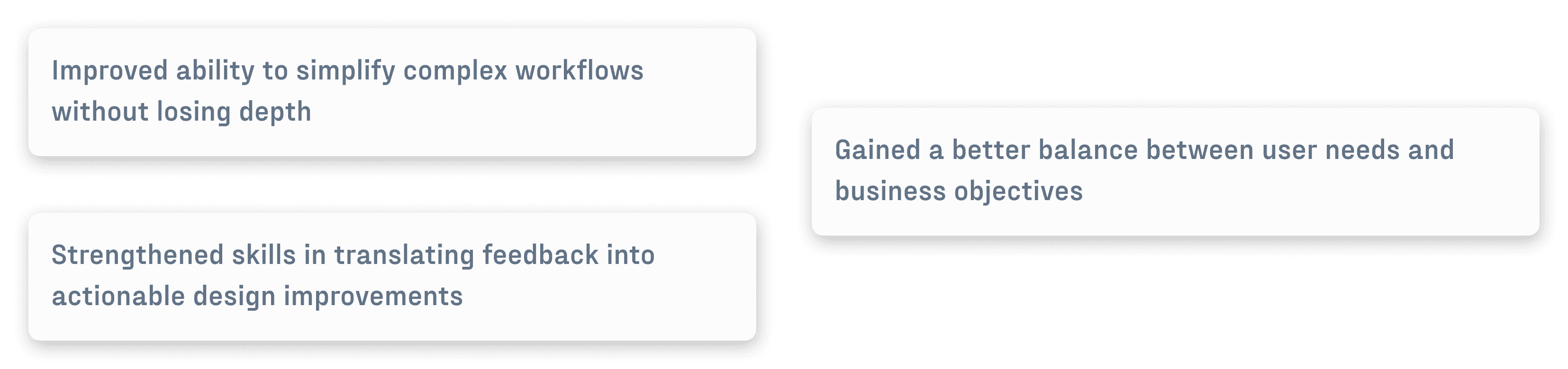
Continuous feedback throughout the process helped me better understand user needs and translate them into practical, impactful design decisions. Following are some more key takeaways.
Continuous feedback throughout the process helped me better understand user needs and translate them into practical, impactful design decisions. Following are some more key takeaways.