
From legacy to Material 3: redesigning Android experience
From legacy to Material 3: redesigning Android experience
A decade-old interface, 95% of our users, and one bold decision: rebuild from the ground up.
A decade-old interface, 95% of our users, and one bold decision: rebuild from the ground up.
B2B
B2B
Mobile application
Mobile application
SaaS
SaaS
Role
Role
Led the revamp of Android agents. Collaborated closely with developers and product managers; partnered with the design system team to introduce new Android-specific components. Worked directly with cross-functional teams to ensure seamless implementation and alignment.
Led the revamp of Android agents. Collaborated closely with developers and product managers; partnered with the design system team to introduce new Android-specific components. Worked directly with cross-functional teams to ensure seamless implementation and alignment.
Team
Team
1 product designer
3 product manager
7 software engineers
1 product designer
3 product manager
7 software engineers
Timeline
Timeline
2 months
2 months
Setting the Stage: Why this redesign, and Why now?
Setting the Stage: Why this redesign, and Why now?
For over a decade, our Android interface quietly served millions, but beneath the surface, cracks were forming. Components were patched together, custom elements tangled with aging Material Design, and icon files hid in scattered folders across projects. With Android claiming 95% of our user base and engineering teams hungry for better workflows, the message was clear: it was time to reset, rebuild, and reimagine.
For over a decade, our Android interface quietly served millions, but beneath the surface, cracks were forming. Components were patched together, custom elements tangled with aging Material Design, and icon files hid in scattered folders across projects. With Android claiming 95% of our user base and engineering teams hungry for better workflows, the message was clear: it was time to reset, rebuild, and reimagine.
User Distribution

Challenges
🧩 Scattered Components
No centralized library
🎨 Inconsistent Design
80% old Material + 20% custom
📁 Icon Chaos
No single source of truth
⚙️ Inefficient Workflows
Hand-crafted XML for every feature
The Quest for Feasibility: Step 1- Asking the Right Questions with SOTI Snap
The Quest for Feasibility: Step 1- Asking the Right Questions with SOTI Snap
I started not with sketches, but with curiosity. Before touching a single pixel, I needed to understand our current reality. I reached out to the Snap Android development team with a list of practical, probing questions designed to uncover not just what we had, but what we truly needed.
I started not with sketches, but with curiosity. Before touching a single pixel, I needed to understand our current reality. I reached out to the Snap Android development team with a list of practical, probing questions designed to uncover not just what we had, but what we truly needed.
Which design system are we following now for Android?
Which design system are we following now for Android?
80% of our UI came straight from old Material Design; the rest was a jumble of custom elements.
80% of our UI came straight from old Material Design; the rest was a jumble of custom elements.
What’s our Android vs. iOS user count? Are we designing for everyone, or mostly Android?
What’s our Android vs. iOS user count? Are we designing for everyone, or mostly Android?
Only 5% of users were on iOS, so why multiply our design work?
Only 5% of users were on iOS, so why multiply our design work?
Where do our icons live? Is there a system...or a folder...or just chaos?
Where do our icons live? Is there a system...or a folder...or just chaos?
No proper icon folder, a design scavenger hunt every time.
No proper icon folder, a design scavenger hunt every time.
Could our devs work more efficiently with a native design system?
Could our devs work more efficiently with a native design system?
Developers were flexible: they could stick with Elevate or go full-native. After bouncing ideas, we chose the native route for simplicity and longevity.
Developers were flexible: they could stick with Elevate or go full-native. After bouncing ideas, we chose the native route for simplicity and longevity.
Digging Deeper: Step 2- The MobiControl Encounter
Digging Deeper: Step 2- The MobiControl Encounter
Armed with insights from Snap, I connected with the MobiControl Android team. Rashmi Narang and Sharib Zafar brought along two talented developers, and we gathered (virtually), coffee in hand, ready to dive deep into the technical realities and possibilities.
Armed with insights from Snap, I connected with the MobiControl Android team. Rashmi Narang and Sharib Zafar brought along two talented developers, and we gathered (virtually), coffee in hand, ready to dive deep into the technical realities and possibilities.

Key Discussion points
Component Management: The revelation: no shared library existed. Every feature required hand-crafted XML, multiplying development time and introducing inconsistencies.
The Path Forward: The consensus was unanimous: Jetpack Compose with Material 3 represented not just a better way, but a modern, faster, and more scalable foundation for our future.
The Icon Solution: When I pitched centralizing around Elevate icons, the relief in the virtual room. Finally, one library. One source of truth.
Decision Time: Synthesis and Strategy
Decision Time: Synthesis and Strategy
With our strategy crystalized and the team aligned, I knew it was time to immerse myself in the world that would shape our future UI: Material Design 3.
With our strategy crystalized and the team aligned, I knew it was time to immerse myself in the world that would shape our future UI: Material Design 3.
Why Research Comes Next
Why Research Comes Next
Earlier conversations made one thing clear: Jetpack Compose and Material Design 3 weren’t just buzzwords; they were the building blocks for our revamp. But to lead this change confidently, I needed more than surface knowledge.
Earlier conversations made one thing clear: Jetpack Compose and Material Design 3 weren’t just buzzwords; they were the building blocks for our revamp. But to lead this change confidently, I needed more than surface knowledge.
Immersing in Material Design 3
Immersing in Material Design 3
I began by asking:
I began by asking:
What’s truly different about Material You, beyond what we see on the surface?
What’s truly different about Material You, beyond what we see on the surface?
Which new tokens, color systems, and motion principles could best fit our context?
Which new tokens, color systems, and motion principles could best fit our context?
How have real teams dealt with migration, what struggles, what payoffs?
How have real teams dealt with migration, what struggles, what payoffs?
From official Google documentation to hands-on migration guides and case studies from companies who’d gone before us, my reading list grew.
From official Google documentation to hands-on migration guides and case studies from companies who’d gone before us, my reading list grew.
Standout Discoveries
Personalization is core: Material 3 puts user preference at the center. Dynamic color, adaptability, and expressive shapes offer a human touch.
Tokens everywhere: Color, spacing, typography all standardized via tokens, making them easy to update, scale, and maintain (music to a system designer’s ears).
Jetpack Compose Synergy: Material 3 is deeply embedded in Compose, streamlining development and giving us access to the latest UI improvements right out of the box.
New Components: Out-of-the-box components like large buttons, filled and outlined text fields, updated navigation bars ready to use, and less to build from scratch.
Accessibility & Motion: Emphasis on improved legibility, motion that feels purposeful, and a design that's flexible for every user.
Material design in SOTI Agents vs Material design 3
Material design in SOTI Agents vs Material design 3

Reading about Material 3 didn't just teach me new rules, it inspired new questions:
Reading about Material 3 didn't just teach me new rules, it inspired new questions:
How can we keep our interface feeling "ours" while embracing platform conventions?
How can we keep our interface feeling "ours" while embracing platform conventions?
How much do we leverage out-of-the-box vs. customizing for our brand voice?
How much do we leverage out-of-the-box vs. customizing for our brand voice?
What are the practical hurdles (and hidden wins) of shifting both dev and design teams to this new paradigm?
What are the practical hurdles (and hidden wins) of shifting both dev and design teams to this new paradigm?
Translating Insights to Action - The Figma Expedition
Translating Insights to Action - The Figma Expedition

"After the second or third screen, what should've felt like design flow was turning into design drag."
"After the second or third screen, what should've felt like design flow was turning into design drag."
The Problem:
For each new screen, I had to manually drag every single component from the Material Design UI kit. Updating colors and swapping in our custom icons wasn't seamless. Every tweak, no matter how small, was eating into creative momentum.
For each new screen, I had to manually drag every single component from the Material Design UI kit. Updating colors and swapping in our custom icons wasn't seamless. Every tweak, no matter how small, was eating into creative momentum.
Solution after decision

I brought my challenge to my design manager and leads. After weighing both options, I chose the bulk-import approach. It felt more systematic and would, in theory, accelerate later work. The upfront investment would pay dividends as we scaled.
I brought my challenge to my design manager and leads. After weighing both options, I chose the bulk-import approach. It felt more systematic and would, in theory, accelerate later work. The upfront investment would pay dividends as we scaled.
The Color Naming Conundrum
The Color Naming Conundrum
No sooner had I made headway building out components than a new obstacle appeared: our color systems were speaking different languages.
No sooner had I made headway building out components than a new obstacle appeared: our color systems were speaking different languages.

The Problem:
Material's color style names and our Elevate token naming were incompatible. 'Surface,' 'Primary,' 'Secondary'—great in Material's context, but mapping these to our Elevate tokens was a headache. Each component required mental translation.
Material's color style names and our Elevate token naming were incompatible. 'Surface,' 'Primary,' 'Secondary'—great in Material's context, but mapping these to our Elevate tokens was a headache. Each component required mental translation.
The Solution - Theme Builder Spotlight

The Resolution
I circled back to my leads, who recommended the Material Design Theme Builder plugin for Figma. This became my secret weapon. It helped bridge the gap, letting me map Material colors to our existing tokens. As I made transitions, I annotated each style, leaving breadcrumbs for the team to later rename and align everything perfectly with our token system.
I circled back to my leads, who recommended the Material Design Theme Builder plugin for Figma. This became my secret weapon. It helped bridge the gap, letting me map Material colors to our existing tokens. As I made transitions, I annotated each style, leaving breadcrumbs for the team to later rename and align everything perfectly with our token system.
Annotation examples

From Manual Styling to Token-Driven System
From Manual Styling to Token-Driven System
Once the foundation was in place, the next step was to bring true consistency to the entire UI. This wasn't about making things look the same, it was about making them behave as a system.
Once the foundation was in place, the next step was to bring true consistency to the entire UI. This wasn't about making things look the same, it was about making them behave as a system.
The Systematic Approach
I moved through the design file component by component, replacing one-off color styles with the color tokens I had created in Figma. To make this scalable, I aligned the token structure with Material Design Theming, every state, surface, text value, and accent mapped cleanly to a defined role instead of an arbitrary hex code
I moved through the design file component by component, replacing one-off color styles with the color tokens I had created in Figma. To make this scalable, I aligned the token structure with Material Design Theming, every state, surface, text value, and accent mapped cleanly to a defined role instead of an arbitrary hex code
"With tokens applied, the system started behaving like a system. Updating a primary color no longer meant hunting through frames, it meant adjusting a token and watching the UI respond predictably."
"With tokens applied, the system started behaving like a system. Updating a primary color no longer meant hunting through frames, it meant adjusting a token and watching the UI respond predictably."
Impact Metrics
3
PRODUCTS UNIFIED
17,000
customers worldwide
1
STRUCTURED FOUNDATION
20+ million
devices
100%
TOKEN-DRIVEN SYSTEM
100%
TOKEN-DRIVEN SYSTEM
After tokens were applied, I brought every screen back into place, old and new, so we could see the transformation end to end. This wasn't just a visual refresh, it created a shared baseline that helped Snap Agent move forward faster, and it unlocked reuse for Surf and MobiControl. Instead of designing three separate experiences, we could evolve one structured foundation and adapt it across products.
After tokens were applied, I brought every screen back into place, old and new, so we could see the transformation end to end. This wasn't just a visual refresh, it created a shared baseline that helped Snap Agent move forward faster, and it unlocked reuse for Surf and MobiControl. Instead of designing three separate experiences, we could evolve one structured foundation and adapt it across products.
Before & After Showcase
Before & After Showcase
Next I tried comparing all the improvements done.
Next I tried comparing all the improvements done.


Old vs New


Measuring Impact - Early Signals & Future Potential
Measuring Impact - Early Signals & Future Potential
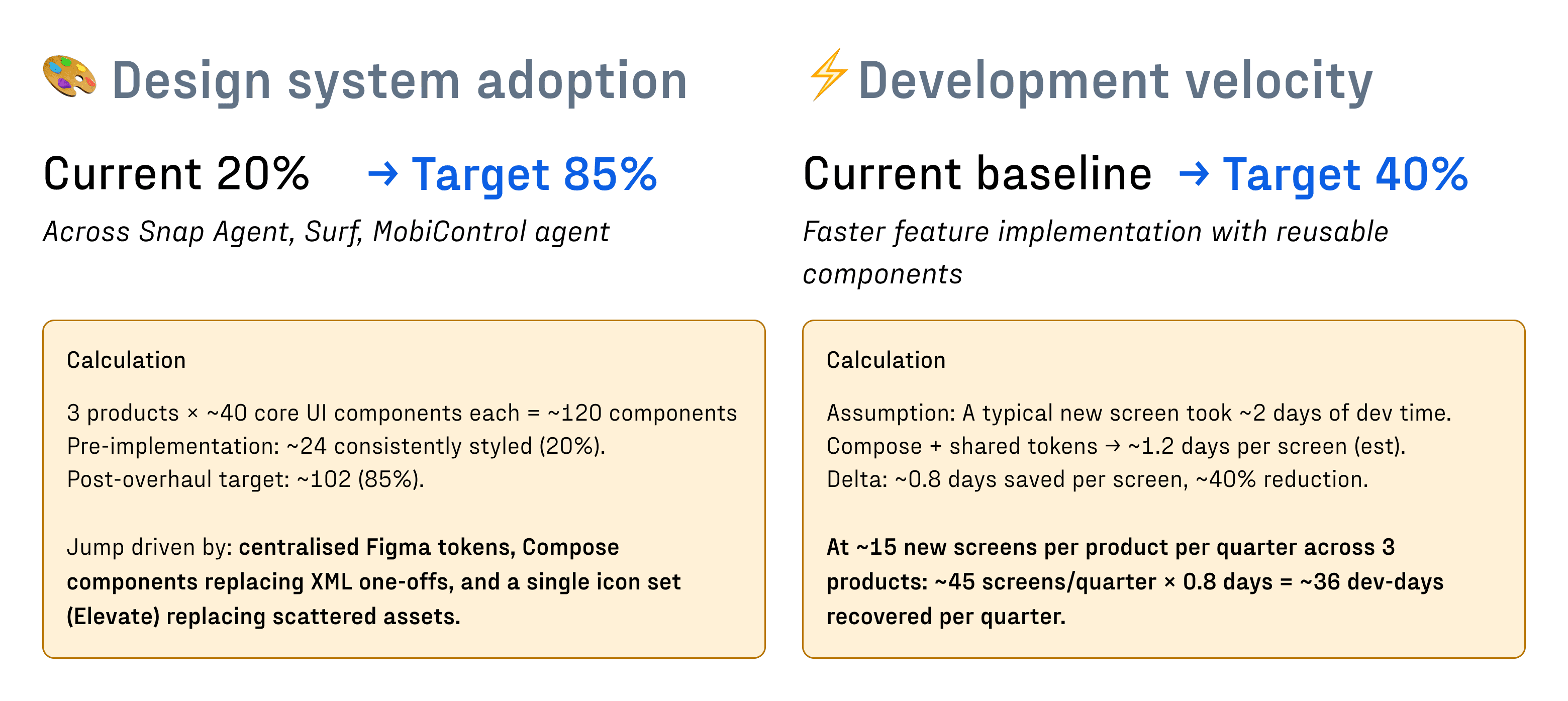
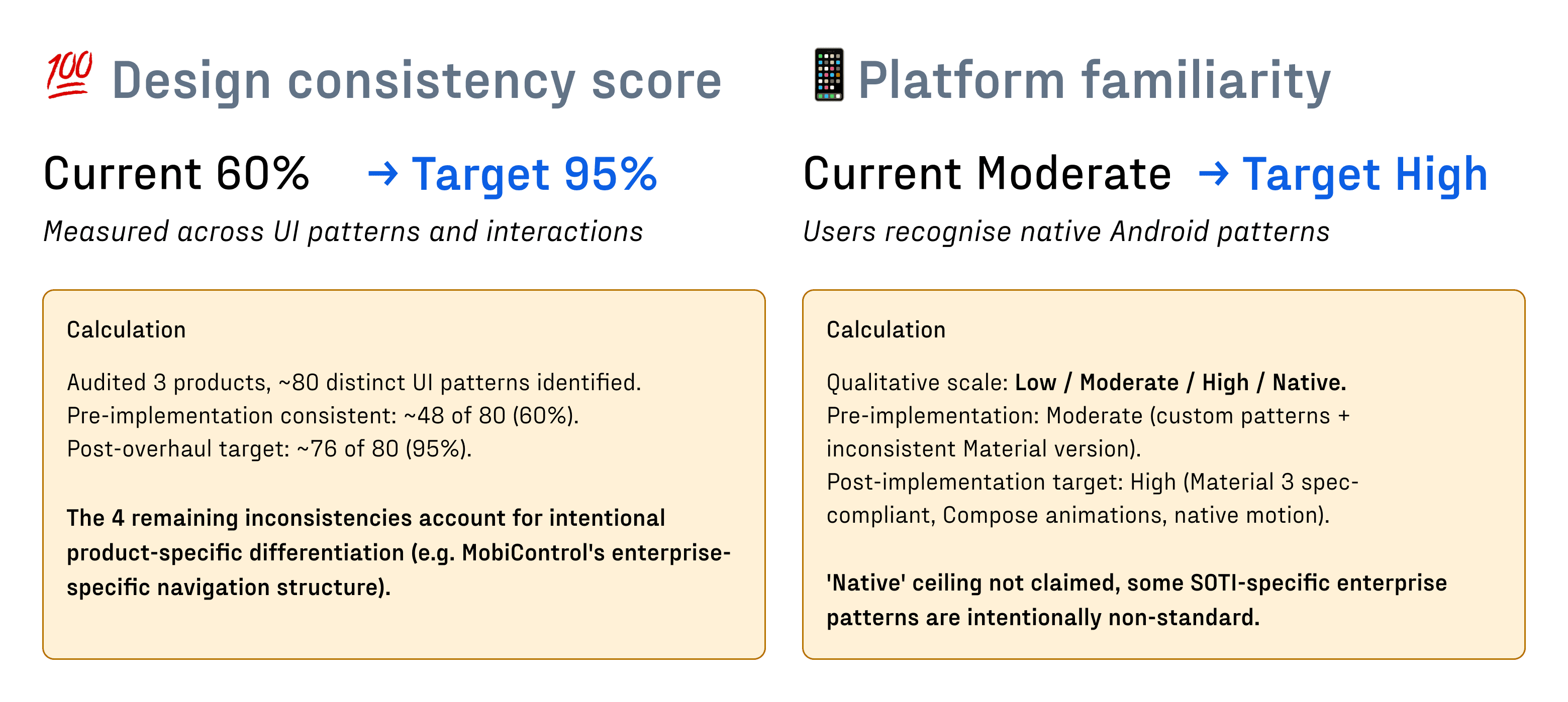
The redesign is currently in development, but early indicators suggest we're on track for meaningful transformation. While we await full implementation metrics, we can project the impact based on design system best practices and initial team feedback.
The redesign is currently in development, but early indicators suggest we're on track for meaningful transformation. While we await full implementation metrics, we can project the impact based on design system best practices and initial team feedback.
Projected imapct
Conclusion - Looking Forward
Conclusion - Looking Forward
What began as a conversation about scattered icons and aging components evolved into a complete system transformation. But this isn't just an ending, it's a new beginning.
What began as a conversation about scattered icons and aging components evolved into a complete system transformation. But this isn't just an ending, it's a new beginning.
Journey summary

Key Takeaways

Design isn't just about choosing pretty colors and layouts, it's navigating real, gritty moments: running into walls, looping back for help, and finding tools and people to clear the path forward. With this foundation in place, we're not just maintaining a design system; we're enabling faster iteration, consistent experiences, and a future where design and development move in harmony.
Design isn't just about choosing pretty colors and layouts, it's navigating real, gritty moments: running into walls, looping back for help, and finding tools and people to clear the path forward. With this foundation in place, we're not just maintaining a design system; we're enabling faster iteration, consistent experiences, and a future where design and development move in harmony.